
Nowadays, the online marketing discussion has moved from convincing someone that they need a website to emphasize how that website must look great and be responsive. Since 2015, Google and other search engines have started giving priority to websites that are easier to use on mobile. This makes sense because a huge percentage of web users will browse your website on mobile. A good web design services company in Mountain Home, Arkansas will offer responsive design services right out of the box.
What is Responsive Design in the First Place?
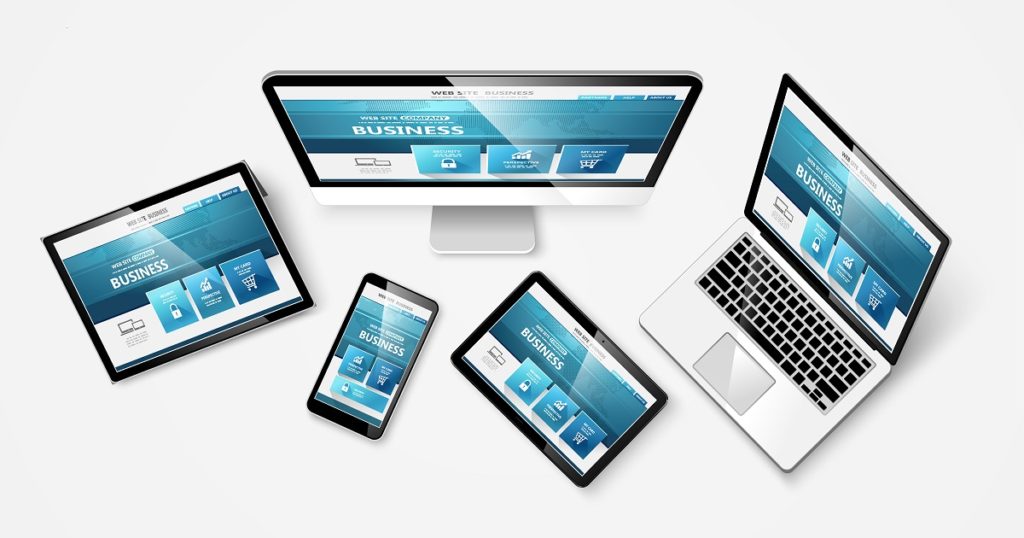
Responsive design is all about coming up with a design that automatically scales down or rearranges content and elements so that they are all visible without zooming in or out. The goal is to ensure that your visitors can easily read, click, tap, and fill forms on your website quickly without squinting or having to scroll sideways to access out-of-view elements.
With responsive design, you no longer have to invest in an independent website for smartphone users. The responsive design standards have become better over time, and your design can comfortably accommodate any screen size without your website designer having to charge you more.
Now that the definitions and clarifications are out of the way, we can look into why you need a responsive design for your website.
Responsive Designs Are Easier to Manage
Design standards have been standardized, and developers use one of the many design frameworks that make implementation a breeze. This means that the designer will come up with a one-size-fits-all solution faster and they will do so following market standards that other developers in the future can comprehend–as long as they understand the underlying framework. This, coupled with the fact that you will not need a separate mobile website, makes maintenance and upgrades easier even if you cannot find the design team that worked on the website the very first time.
Search Engines Will Rank You Better

Google, the biggest search engine by now, first started favoring responsive websites in 2015. Things escalated in 2018 when they pushed out the mobile-first indexing algorithm that gives priority to mobile-friendly websites before checking desktop-only competitors.
While there are many mobile-friendly websites out there, going responsive will give you a slight edge over competitors who haven’t implemented such designs yet. It levels the playing field even if your competition already has mobile-friendly sites.
Improved User Experience Means More Conversion
This is by far the most beneficial part of going responsive. People will find your website more lovable and easier to interact with. This will, in turn, increase the number of people who take action on your site and go further down your marketing funnel. This is a great win because websites are all about converting visitors into customers.
If this is the first time you are taking your business online, you should insist on a responsive design from the agency. If you already have a website that you want to upgrade, ensure that your designer converts it to a responsive design.